
: Perfect Dimensions for Your Profile")
Your LinkedIn banner is one of the first things people notice when they visit your profile. It’s your chance to make a strong first impression, whether you’re job hunting, networking, or growing your business. But to make it look perfect, you need to know the right LinkedIn banner size in 2025. In this detailed guide, we’ll break down the perfect dimensions, design tips, and common mistakes so your profile stands out beautifully on any device.
What Is the Perfect LinkedIn Banner Size?
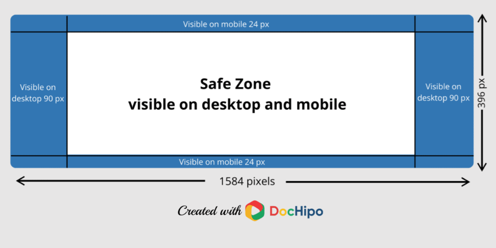
The perfect LinkedIn banner size for 2025 is 1584 x 396 pixels with an aspect ratio of 4:1. This applies to personal LinkedIn profiles. Keeping your banner image within these dimensions ensures it displays correctly on both desktop and mobile screens.
However, LinkedIn often crops or scales images slightly depending on the device. That’s why it’s smart to use a high-resolution image and keep key elements (like text or logos) away from the edges. A safe margin of about 100 pixels from all sides will prevent important parts of your design from being cut off.
Also, LinkedIn accepts JPG and PNG formats with a maximum file size of 8MB. Using these settings guarantees your banner won’t lose quality after uploading.
Why Does LinkedIn Banner Size Matter?
Your LinkedIn banner isn’t just a background—it’s digital real estate that can tell your story. A properly sized banner makes your profile look professional and polished.
If your image is too small, it can appear blurry or pixelated. If it’s too large, LinkedIn may crop it awkwardly, cutting off key visuals or text. This can give visitors the impression that you’re careless with details, which isn’t what you want when networking or attracting recruiters.
Think of your banner like a billboard. It should grab attention, communicate who you are, and leave a memorable impression—all in a single glance.
LinkedIn Banner Size for Personal Profiles
For personal LinkedIn profiles, the banner (also called the background photo or cover photo) is your chance to personalize your page and show your brand. Whether you’re a professional, student, or entrepreneur, using the right dimensions is crucial.
Here’s what you need to know:
Recommended Dimensions
The recommended size is 1584 x 396 pixels. Sticking to this resolution avoids unwanted stretching or cropping. A higher resolution ensures crisp, clear images that look sharp even on large monitors.
Safe Zones to Avoid Cropping
LinkedIn sometimes adjusts your banner depending on the screen size. To keep your key design elements safe:
- Avoid placing text or logos at the top, bottom, or sides of the image.
- Keep important content within the central area of the banner.
- Leave about 100 pixels of padding on all edges as a buffer zone.
This way, your design will still look great on mobile or when viewed in a browser window of any size.
File Types and Sizes
LinkedIn supports:
- File types: JPG, PNG
- Max size: 8 MB
- Color profile: sRGB recommended for best color accuracy
Avoid GIFs or other animated formats—they aren’t supported for banners.
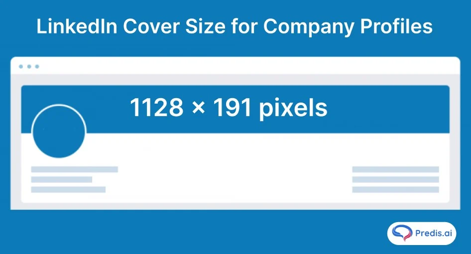
LinkedIn Banner Size for Company Pages
Company LinkedIn pages use different banner dimensions than personal profiles. For a company page, the recommended banner size is 1128 x 191 pixels with an aspect ratio of roughly 6:1.
This is a much shorter, wider image compared to personal profiles. It’s important for brands to design a company banner that reflects their corporate identity, using colors, logos, and taglines effectively.
Just like personal profiles, keep key content within the safe zone to prevent it from being cropped on smaller screens. Also, ensure your design matches your company’s branding across other platforms for consistency.
Mobile vs Desktop LinkedIn Banner Size
One of the biggest challenges with LinkedIn banners is how they display differently on desktop and mobile. On desktop, the full dimensions are visible, but on mobile, LinkedIn crops parts of the image to fit smaller screens.
This means a banner that looks great on your computer might look awkward or cut-off on a smartphone.
To fix this, always preview your banner on both desktop and mobile after uploading. This will help you spot and fix any issues before your audience sees them.
Why Mobile View Matters
More than 60% of LinkedIn traffic comes from mobile devices. That’s why it’s critical to design your banner with mobile users in mind. If your text or logo is placed too close to the edges, it might get hidden behind the profile picture or be cropped out entirely on mobile.
Adjusting for Both Views
To make your banner work across all devices:
- Keep key visuals and text centered.
- Use high-resolution images to maintain quality.
- Test how your banner looks on different screen sizes before finalizing.
LinkedIn Banner Design Tips
A well-designed LinkedIn banner does more than look good—it tells people what you’re about. Here are some tips for creating a powerful banner:
- Keep it simple: Avoid clutter. Focus on one or two key messages.
- Use brand colors: For professionals and businesses, align the banner with your personal or corporate branding.
- Add a tagline or call to action: Short, impactful text can encourage visitors to learn more about you or your company.
- Use high-quality images: Pixelated banners hurt credibility. Use professional photos or graphics.
- Highlight achievements: If you’re a professional, consider featuring awards, certifications, or notable projects.
Common LinkedIn Banner Size Mistakes
Avoid these common mistakes:
- Wrong dimensions: Using an incorrect size leads to cropping and poor image quality.
- Overcrowding the design: Too much text or too many elements make it hard to focus.
- Ignoring mobile view: Always check how the banner looks on phones.
- Low-resolution images: Blurry images make your profile look unprofessional.
- Placing key content behind the profile photo: Remember that your profile picture overlaps part of your banner on desktop and mobile.
Thoughts on LinkedIn Banner Size
Your LinkedIn banner is one of the most powerful tools for personal branding. Whether you’re a job seeker or a business owner, getting the size and design right can set you apart from the competition. It’s a small detail, but one that carries a lot of weight in today’s digital world.
The Bottom Line
Your LinkedIn banner is more than just a decorative element—it’s your chance to make a bold statement and capture attention at first glance. By using the correct dimensions (1584 x 396 pixels for personal profiles and 1128 x 191 pixels for company pages), keeping key content within safe zones, and designing with both desktop and mobile in mind, you can create a professional and eye-catching LinkedIn profile.
So don’t settle for the default background. Take the time to create a banner that tells your story and shows off your unique personality or brand. A few extra minutes spent on the right size and design can pay off big in making connections and growing your professional presence.